

Platehack Healthy eating, fewer decisions
Platehack (formerly LazyFit) matches people to doctor-backed meal plans and delivers chef-prepared meals to their door. V1 worked, but felt like a generic SaaS dashboard. I led a ground-up V2: a new visual direction, restructured information architecture and a rebuilt component system across desktop and mobile.
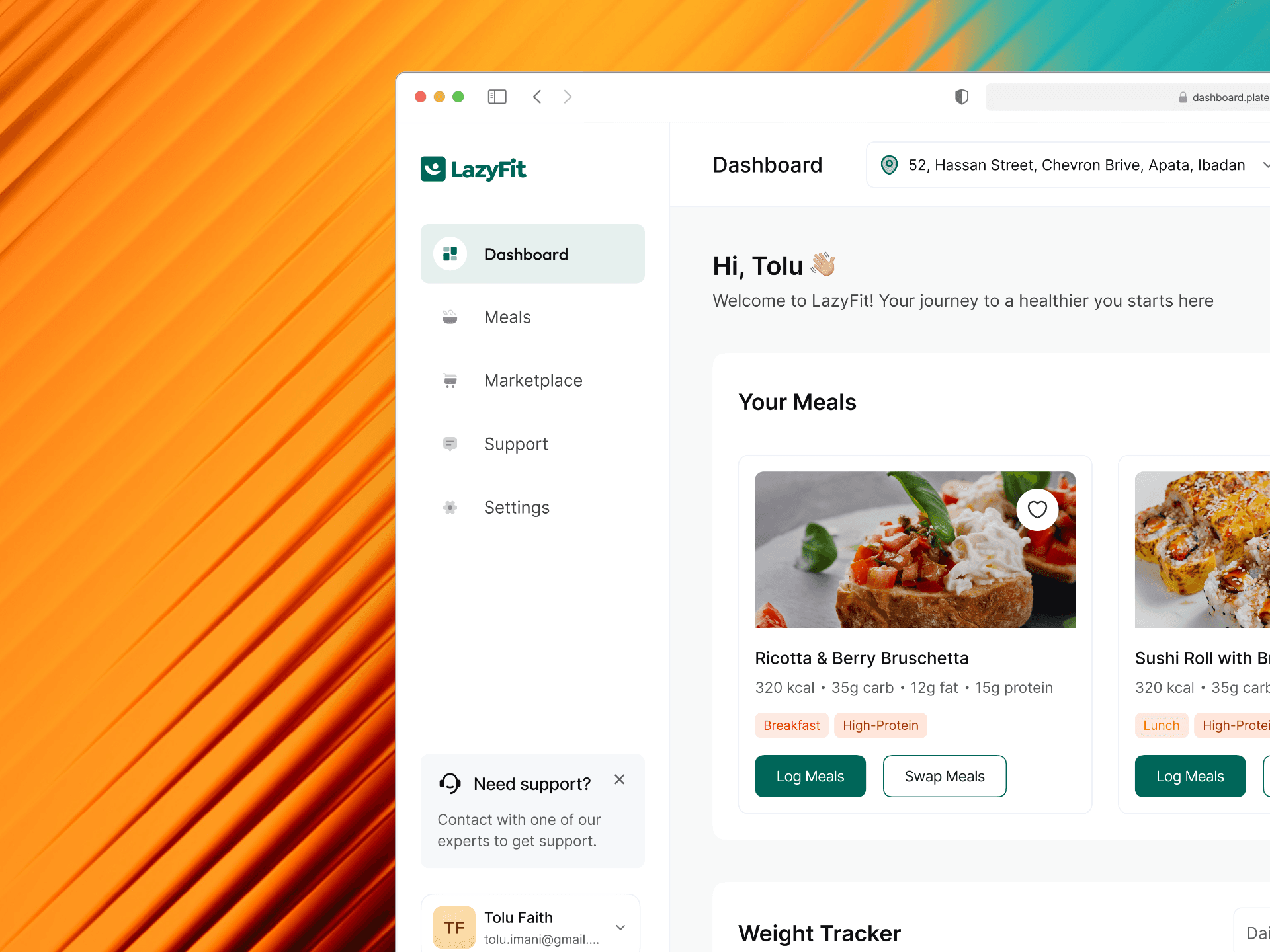
Healthy eating has a conversion problem: the gap between intention and action is wide. Delivery services optimise for convenience; nutrition apps bury people in manual input. Platehack sat between the two — and V1 looked like it.
Subscriber feedback converged on three problems: first login felt overwhelming, logging a meal took too many steps, and accurate nutrition data read as clinical rather than motivating.
The briefMake a data-heavy health product feel personal, not clinical — and get people from “I want this” to “logged” with fewer decisions.
A competitive audit of six products, a review of subscriber feedback, usability walkthroughs with existing subscribers and a full content audit.
Noom, Lifesum and HelloFresh hide complexity behind a sense of progress and celebrate small wins.
→ Motivation first: progress indicators, macro donuts and calorie charts communicate wins before numbers.
Meal swap was the most-used feature — and the most confusing.
→ Swap rebuilt as a dedicated page with filters and a confirmation step.
A daily view alone didn’t give enough context; people wanted their whole week.
→ Daily, weekly and monthly views, plus a full calendar for planning.
Macros were buried two taps deep, right where people make dietary decisions.
→ Macros on every meal card; full nutrition facts one tap from detail.
“Users didn’t want more features. They wanted fewer decisions.”
North star — The product does the thinking; the user confirmsMeals browser
A date-stamped view of today’s plan with persistent Daily, Weekly and Monthly toggles. Each card carries a full-bleed photo, macros and dietary tags, with Log and Swap always visible. On mobile the week collapses into an accordion, and empty days show a quiet empty state instead of a blank row.

Meal detail & nutrition
Detail pairs large food photography with macros, tags and the same two actions. Full nutrition opens in the standard FDA/EU label format — a deliberate choice over a custom visualisation, because people can read a familiar label instantly.


Swap meals
V1’s most complained-about feature became its own page — Find Your Perfect Swap — filterable by meal type, cuisine and diet. A two-step confirmation prevents accidental swaps without slowing intentional ones.


The biggest shift from V1 to V2 was structural, not visual. V1 tried to surface everything; V2 asked what the user needs to do right now, and made that the only obvious option.
The meal calendar nearly got cut as “too complex for an MVP”. It became one of the most appreciated additions in testing — planning ahead feels different from reacting day to day.
And a dedicated page is often the right answer to a broken modal. When a feature is used often enough to matter, it deserves a full screen.